


Pełny widok
Podobne przedmioty
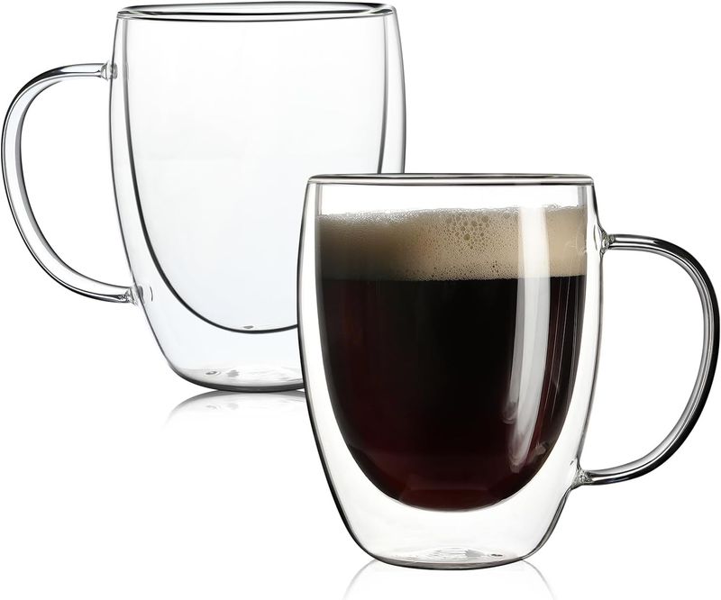
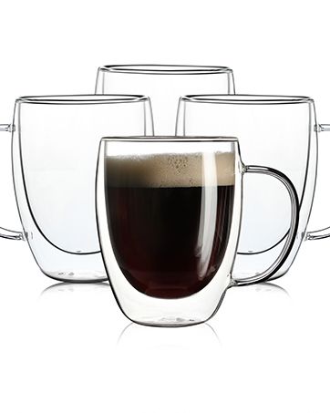
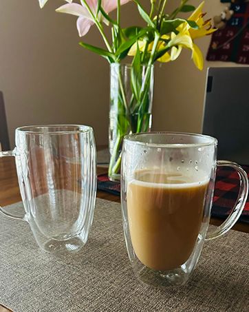
Aurzen 2-pak kubków szklanych z podwójnymi ściankami i uchwytami, duże izolowane kubki do kawy, 12-uncjowe przezroczyste kubki borokrzemianowe,
131,55zł205,08zł
Kolor : 12 uncji-4 sztuki

Ilość :
 Customer Service
Raport
Uwzględnij naruszenie praw autorskichDarmowa standardowa wysyłka. Patrz szczegóły
Szacunkowo między Tue, Dec 9 a Sat, Dec 13
Możesz zwrócić produkt w ciągu 30 dni od daty otrzymania. Patrz szczegóły
Kupuj z ufnością

Gwarancja zwrotu pieniędzy
Odbierz zamówiony przedmiot albo zwróć pieniądze. Dowiedz się więcej
O tym przedmiocie
Źródło: HomeCraft Emporium
Sprzedawca bierze na siebie wszelką odpowiedzialność za tę ofertę.Numer przedmiotu: 30632819
Szczegóły pozycji
Opis przedmiotu od sprzedawcy
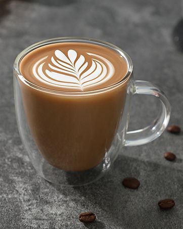
2 Pack Double Walled Glass Coffee Mugs with Handles, Large Insulated Layer Coffee Cups, Clear Borosilicate Mugs, Perfect for Cappuccino, Tea, Latte, Espresso, Hot Beverage, Wine, Microwave Safe: Double wall design, effectively keep hot and cold drinks for a long time, and prevent condensation from forming on the outer wall of the cup.
Large Capacity: These coffee mugs capacity is 12 Oz, which is larger than most mugs on the market. They are suitable for most coffee shops, families, and cafes.
Premium Glass: Made of high-quality borosilicate glass, which is lead-free and BPA-free. Strong and durable, clear and smooth, easy to clean, and dishwasher safe.
Unique Design: The handle of the glass mug is designed with a curve, which is more comfortable to hold. The thick and solid glass body is not easy to break, and the smooth surface makes it easy to clean.
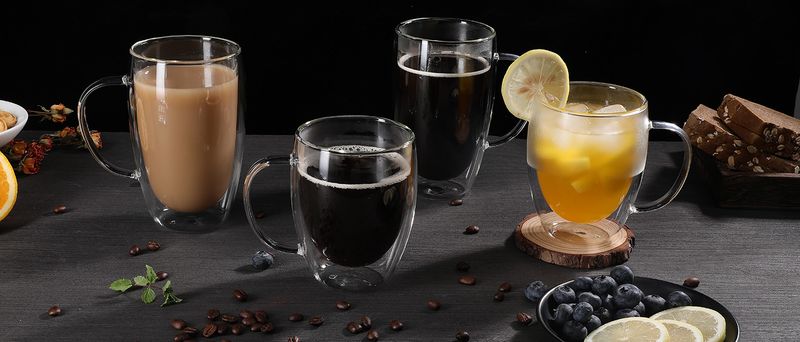
Wide Application: These coffee mugs are suitable for various ocns, such as home, office, party, and so on. They are also ideal gifts for birthdays, anniversaries, weddings, Christmas, and other festivals.
From the brand
.aplus-v2 .container-with-background-image function logShoppableMetrics(moduleName, showsAddToCart) } /* * Used when device = desktop * Configured in: configuration/brazil-config/global/brand-story.cfg */ /* Because the carousel is implemented as an ol list, any lists in the card text will have a secondary list style (letters). This will give an incorrect appearance to viewers, so we set all lists to the primary list style (numbers). */ .aplus-brand-story-card ol li /* Top level containers */ .aplus-module .apm-brand-story-hero .aplus-module .apm-brand-story-card .apm-brand-story-hero, .apm-brand-story-card .aplus-module.brand-story-card-1-four-asin .apm-brand-story-card /* Full background image (Hero 1 -webkit-box-sizing: border-box; box-sizing: border-box; overflow: hidden; position: absolute; width: 100%; height: 100%; } /* Card 1 small images */ .aplus-module .apm-brand-story-image-grid .aplus-module .apm-brand-story-image-grid .apm-brand-story-image-em .aplus-module .apm-brand-story-image-grid .apm-brand-story-image-em .apm-brand-story-image-link .aplus-module .apm-brand-story-image-grid .apm-brand-story-image-em .apm-brand-story-image-link .apm-brand-story-image-img /* Card 3 image */ .aplus-module .apm-brand-story--image /* Text overlays */ .aplus-module .apm-brand-story-text-bottom .aplus-module .apm-brand-story-hero .apm-brand-story-text-bottom .aplus-module.brand-story-card-2-media-asset .apm-brand-story-text-bottom .aplus-module.brand-story-card-1-four-asin .apm-brand-story-text .aplus-module.brand-story-card-1-four-asin .apm-brand-story-text.apm-brand-story-text-single .aplus-module.brand-story-card-1-four-asin .apm-brand-story-text h3 .aplus-module .apm-brand-story-slogan-text .aplus-module .apm-brand-story-faq .aplus-module .apm-brand-story-faq-block .aplus-v2 .apm-brand-story-carousel-container .aplus-v2 .apm-brand-story-carousel-hero-container, .aplus-v2 .apm-brand-story-carousel-hero-container > div /* Ensuring the carousel takes only the space it needs. The sizes need to be set again on the absolutely positioned elements so they can take up space. */ .aplus-v2 .apm-brand-story-carousel-container, .aplus-v2 .apm-brand-story-carousel-hero-container .aplus-v2 .apm-brand-story-carousel-hero-container, .aplus-v2 .apm-brand-story-carousel-hero-container > div .aplus-v2 .apm-brand-story-carousel.a-carousel-container /* This centers the carousel vertically on top of the hero image container and after the area (125px). Margin-top = (heroHeight - cardHeight - AreaHeight) / 2 + AreaHeight */ .aplus-v2 .apm-brand-story-carousel .a-carousel-row-inner /* Cards need to have a width set, otherwise they default to 50px or so. All cards must have the same width. The carousel will resize itself so all cards take the width of the largest card. The left margin is for leaving a space between each card. */ .aplus-v2 .apm-brand-story-carousel .a-carousel-card /* styling the navigation buttons so they are taller, flush with the sides, and have a clean white background */


Filmy
Filmy dla tego produktu


 4.4 na 5 na podstawie 7,646 opinii